Introduction:
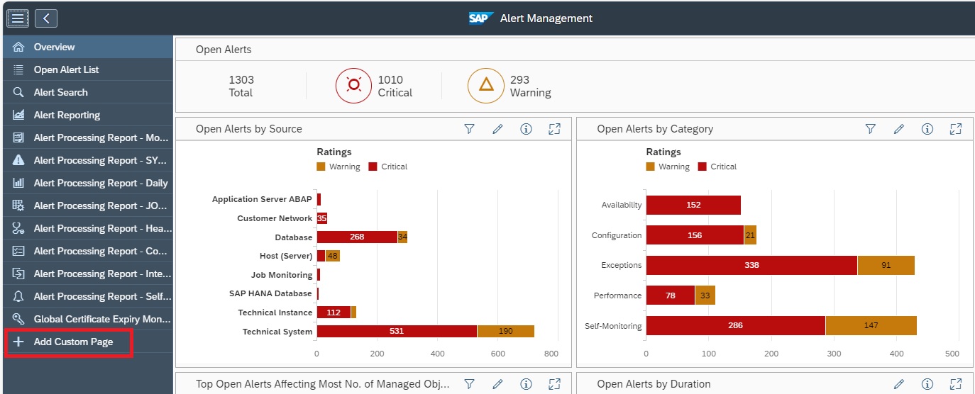
In today’s complex SAP landscapes, organizations need real-time visibility, proactive monitoring, and actionable insights to maintain system performance and availability. SAP Focused Run (FRUN) provides advanced monitoring capabilities, and one of its most powerful features is the OCC (Operation Control Center) Dashboard.
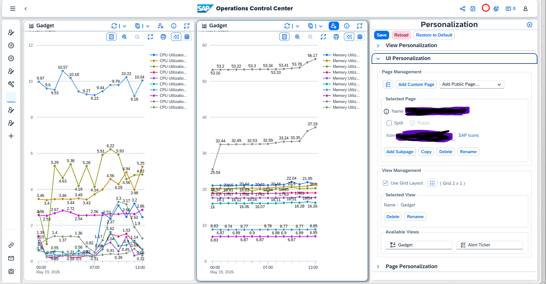
The OCC Dashboard enables SAP teams to visualize key metrics, monitor performance trends, and detect issues early—all through a flexible, customizable interface.
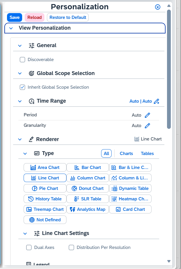
What is OCC Dashboard in SAP Focused Run?
The OCC Dashboard provides direct access to key technical and business metrics stored within SAP Focused Run. It is designed for SAP operations teams and business experts to create custom dashboards for deep analytics and monitoring.
Key characteristics:
- Central web interface for dashboard configuration and visualization
- Supports multiple data providers and monitoring sources
- Ability to combine and filter multiple metrics in a single view
- Flexible visualization using charts, tables, and trend analysis
Please find link attached for your reference-[support.sap.com]
How to Setup an OCC Dashboard (Step-by-Step)
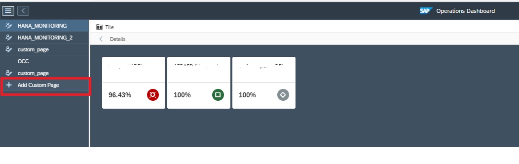
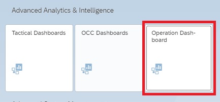
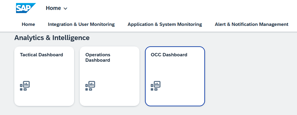
Step 1: Launch Dashboard
- Navigate to OCC Dashboard Fiori Tile
- Open dashboard application
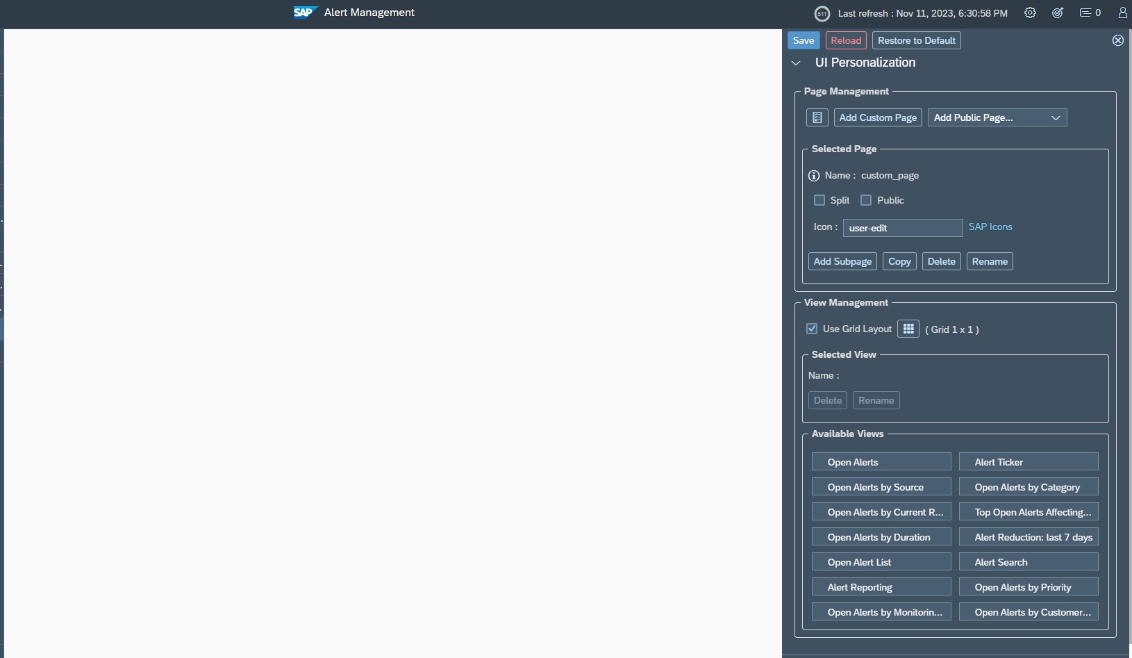
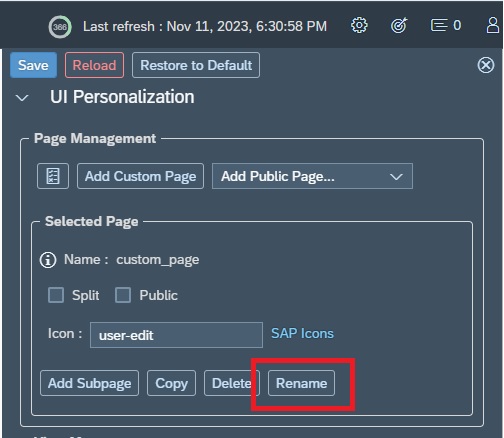
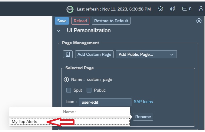
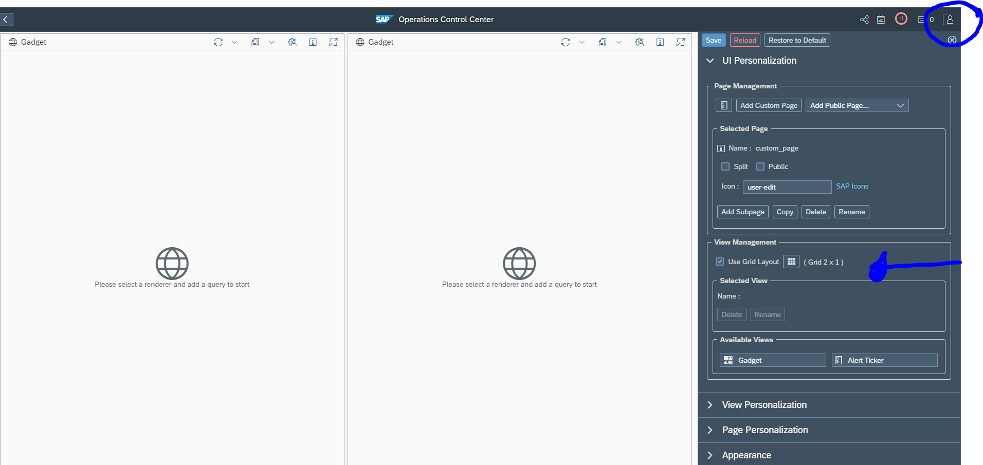
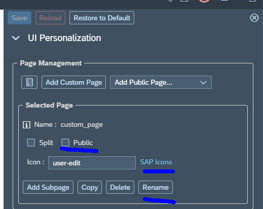
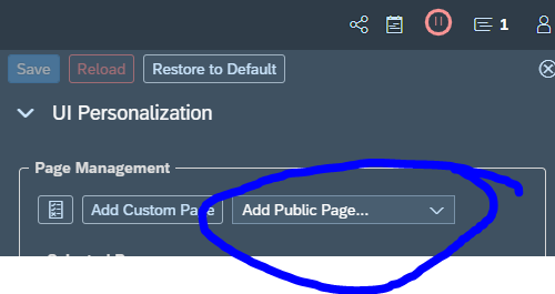
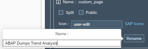
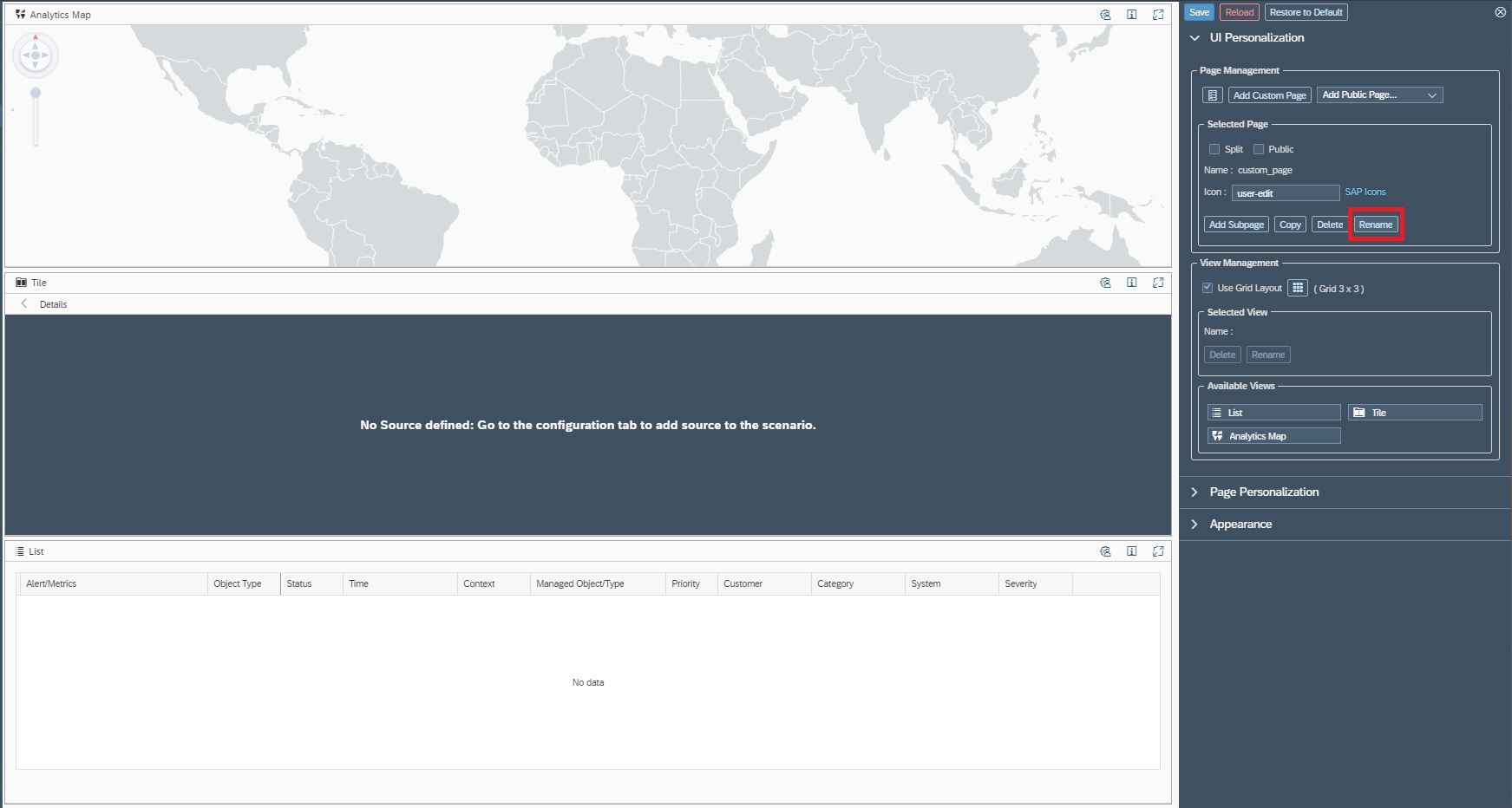
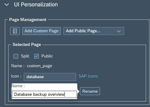
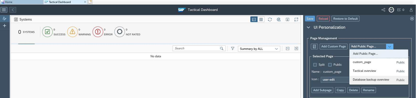
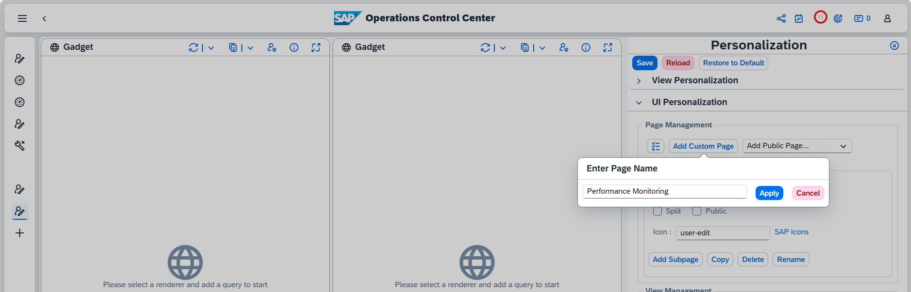
Step 2: Create Custom Page
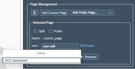
- Click “Add New Dashboard / Custom Page”
- Rename with meaningful name (e.g., Performance Monitoring Dashboard)
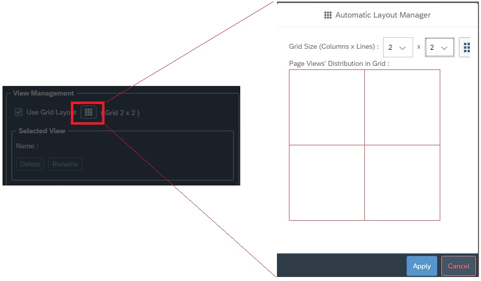
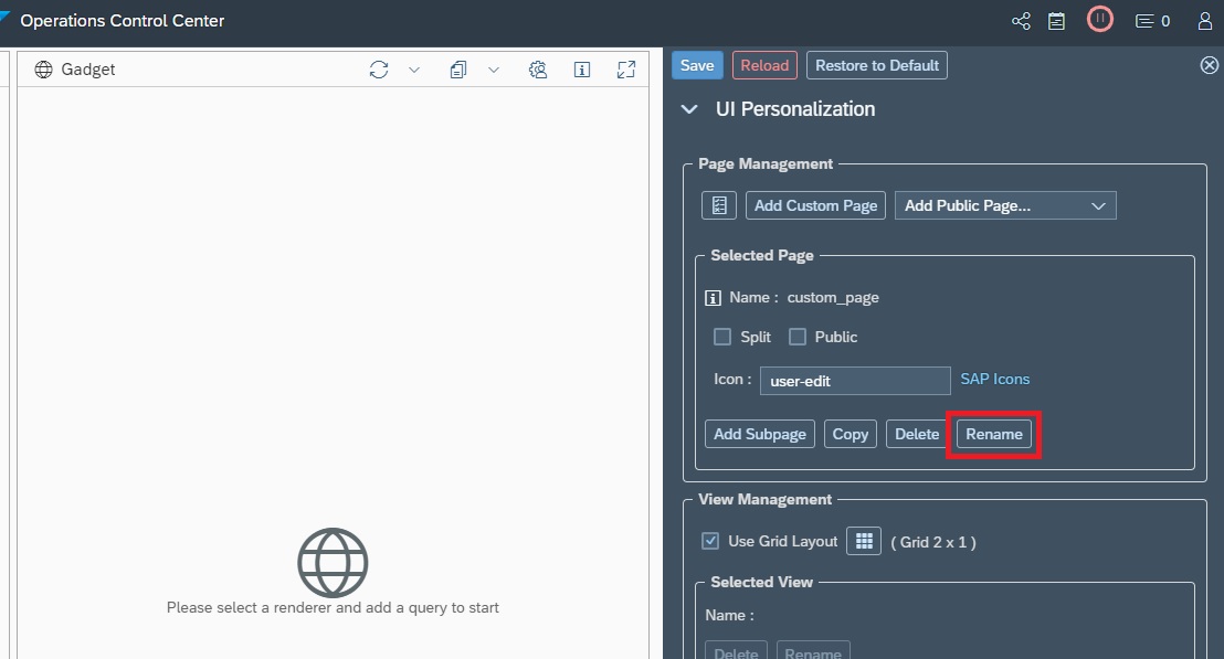
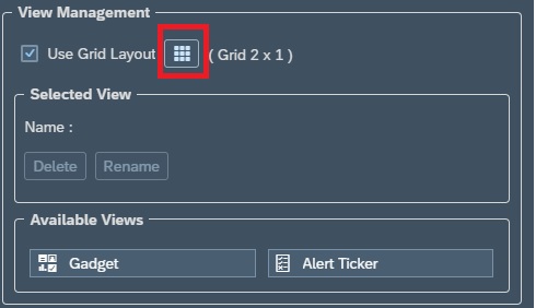
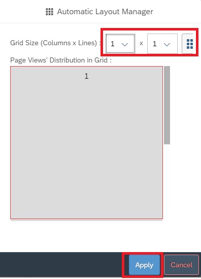
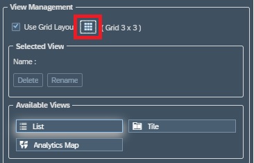
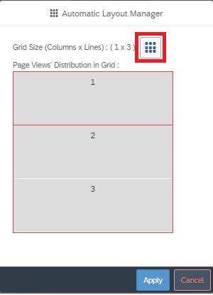
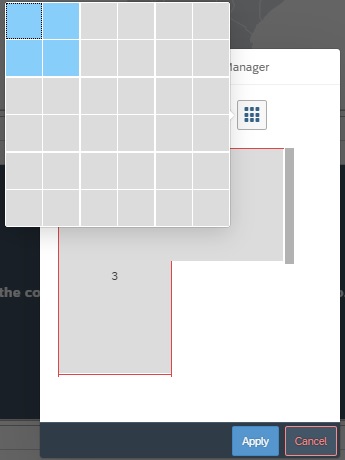
Step 3: Define Layout
- Choose layout (e.g., 2×2 grid or custom structure)
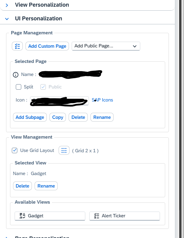
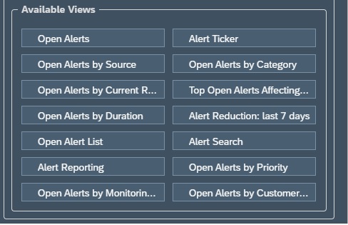
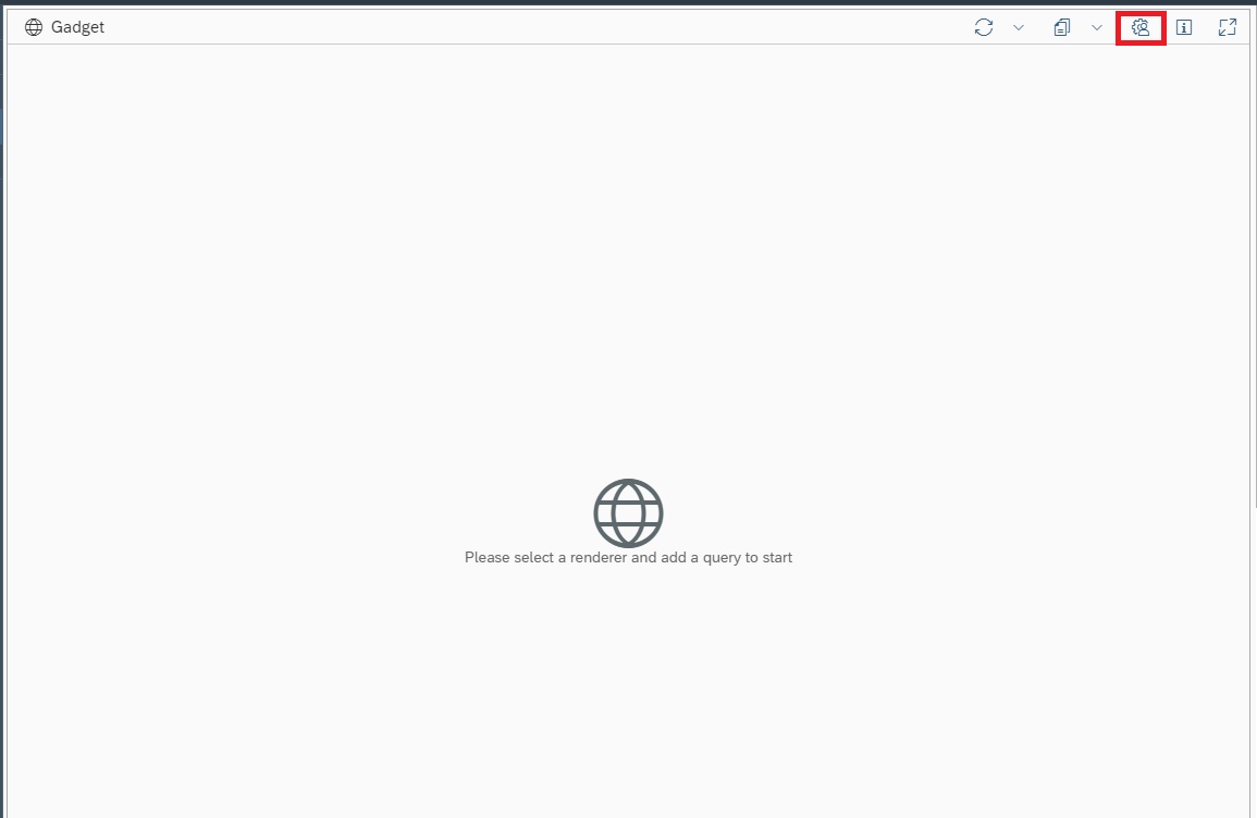
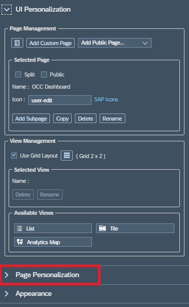
Step 4: Add Views / Widgets
- Select visual components (charts, tables)
- Drag and drop into layout
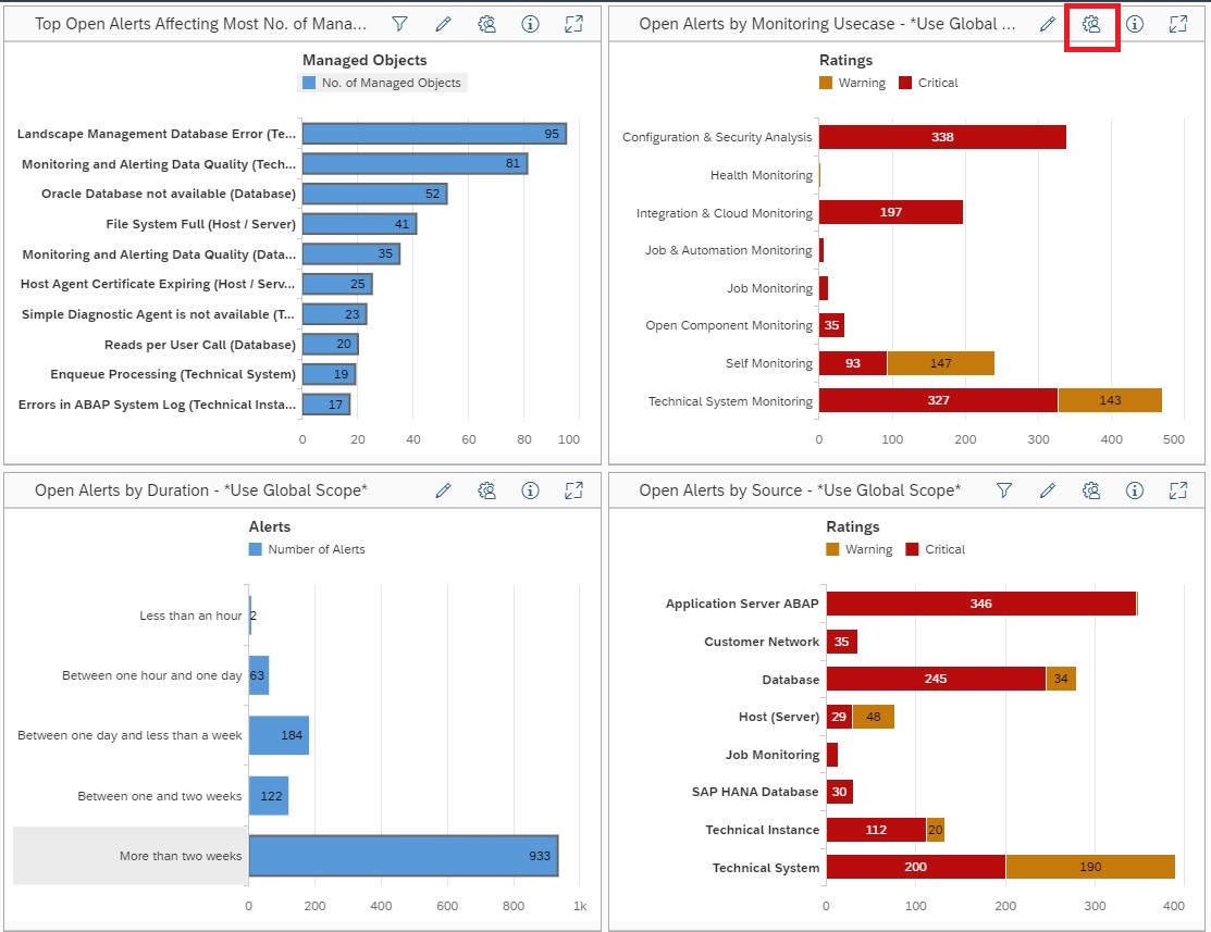
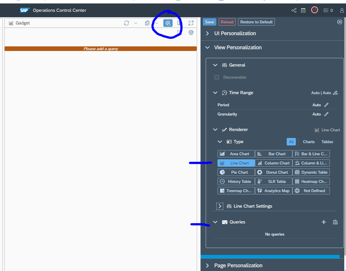
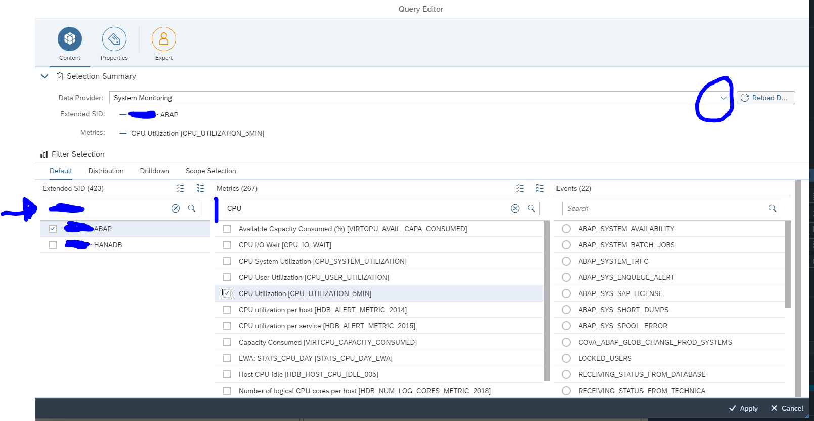
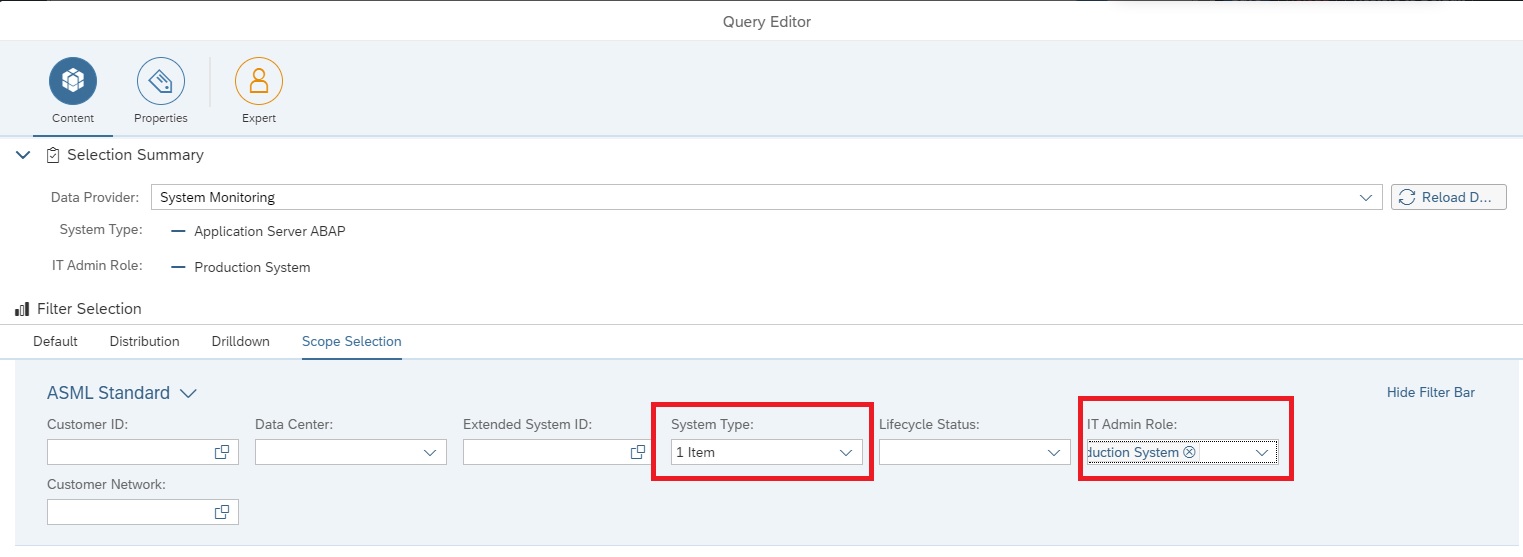
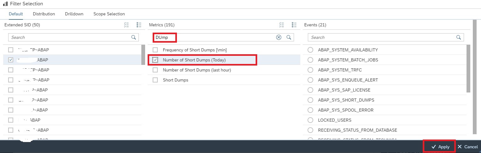
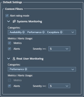
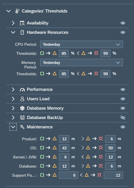
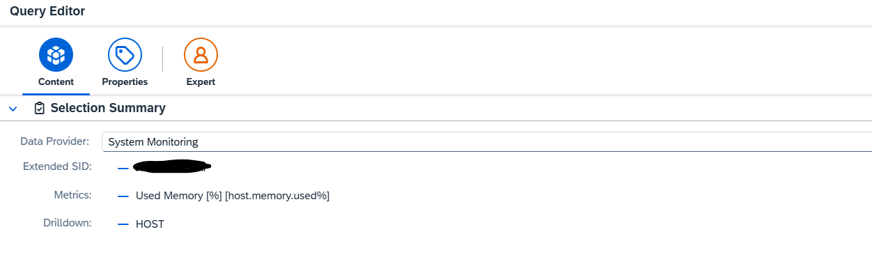
Step 5: Configure Metrics (Core Part)
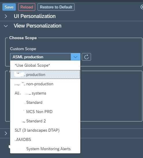
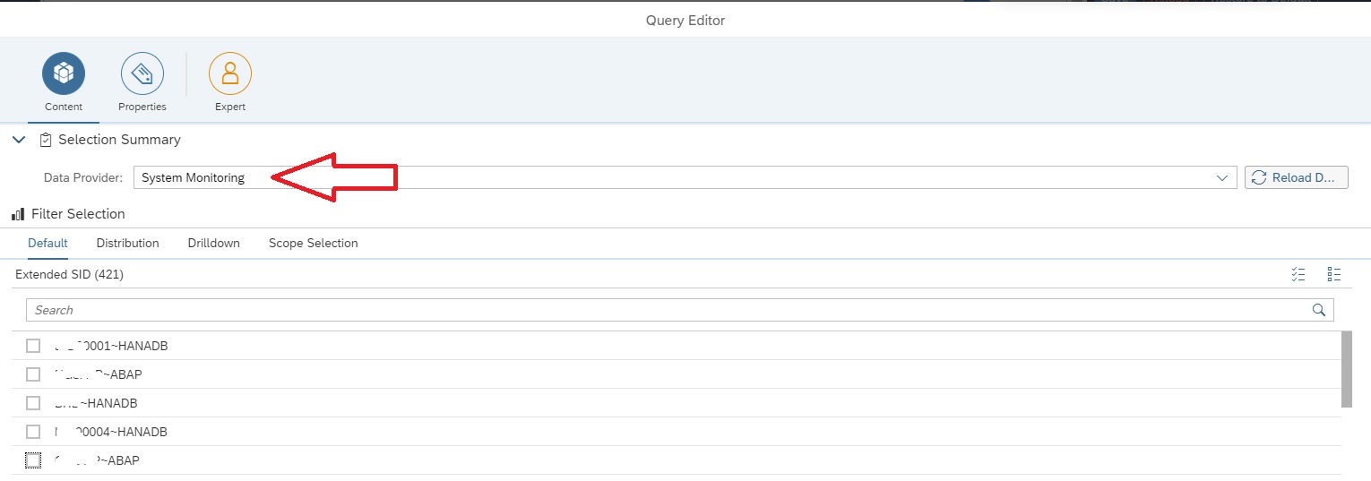
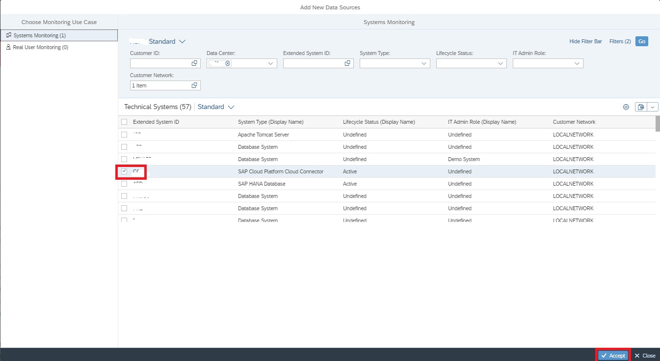
- Select Data Source (e.g., System Monitoring)
- Choose:
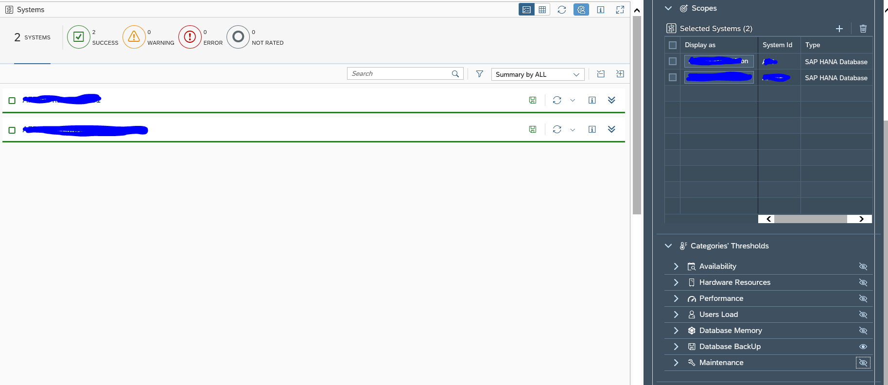
- System (SID)
- Metric (CPU, Memory, Dumps, Response Time)
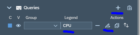
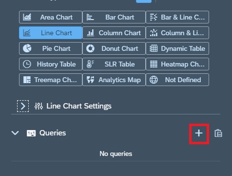
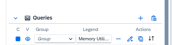
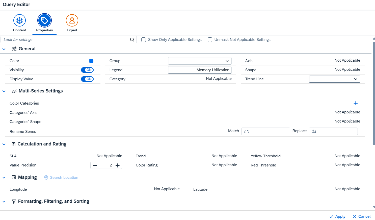
Step 6: Define Query
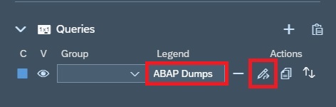
- Add query using “+”
- Assign legend name (e.g., Memory Utilization)
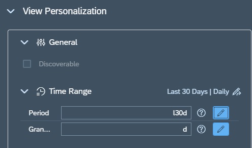
- Configure filters & time range
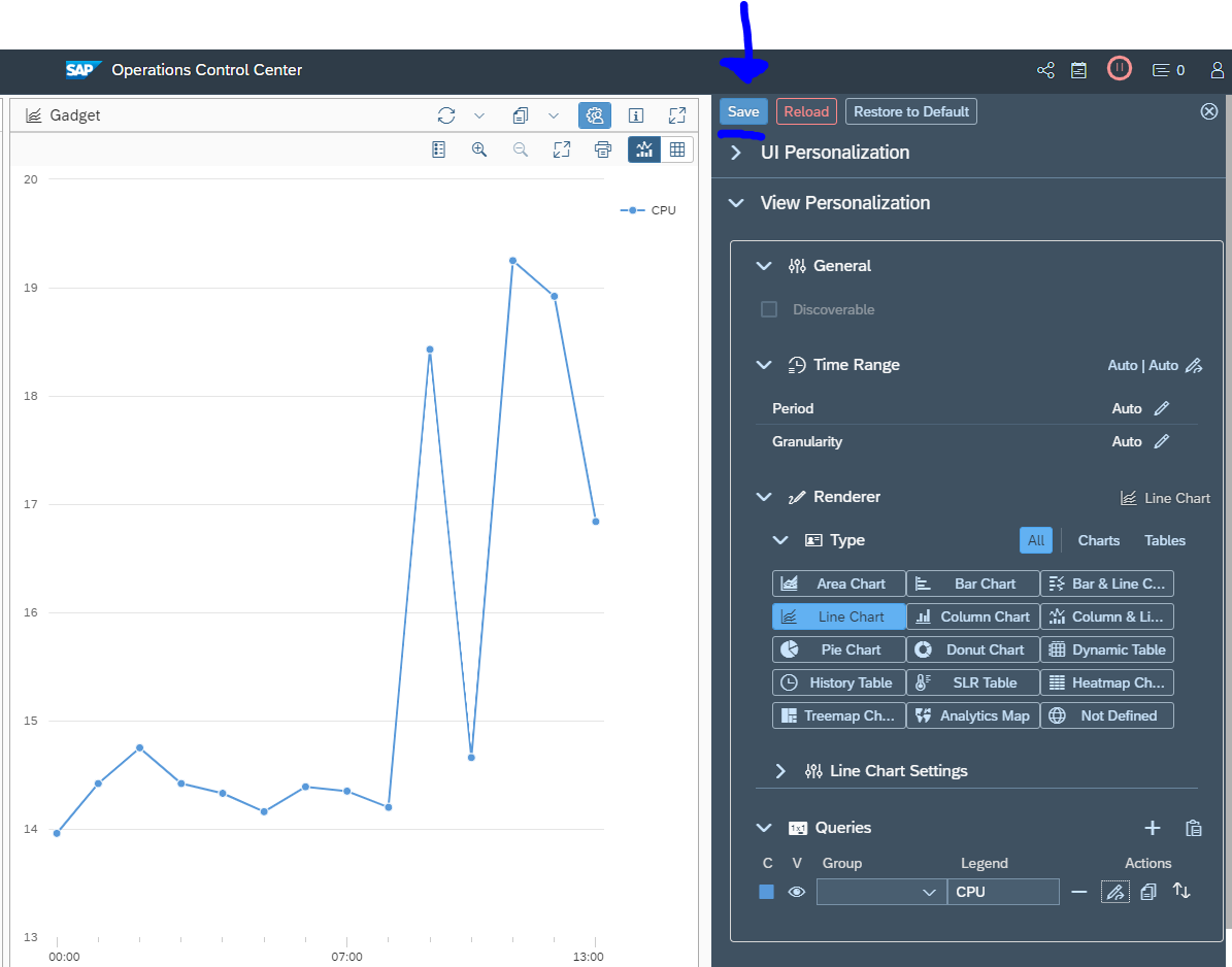
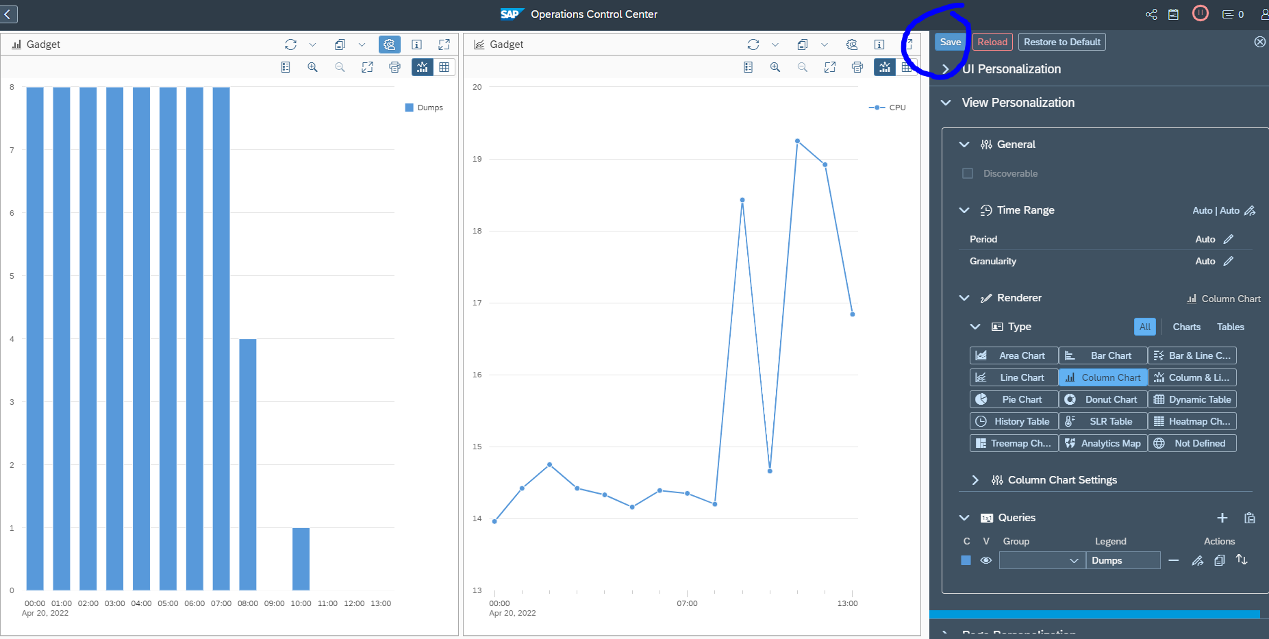
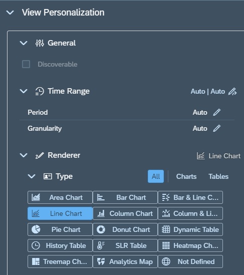
Step 7: Choose Visualization
- Line chart → Trends
- Bar chart → Comparison
- Table → Detailed analysis
Step 8: Save & Test
- Validate data correctness
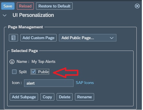
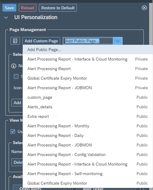
Step 9: Publish Dashboard
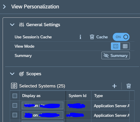
- Make dashboard public for team usage.
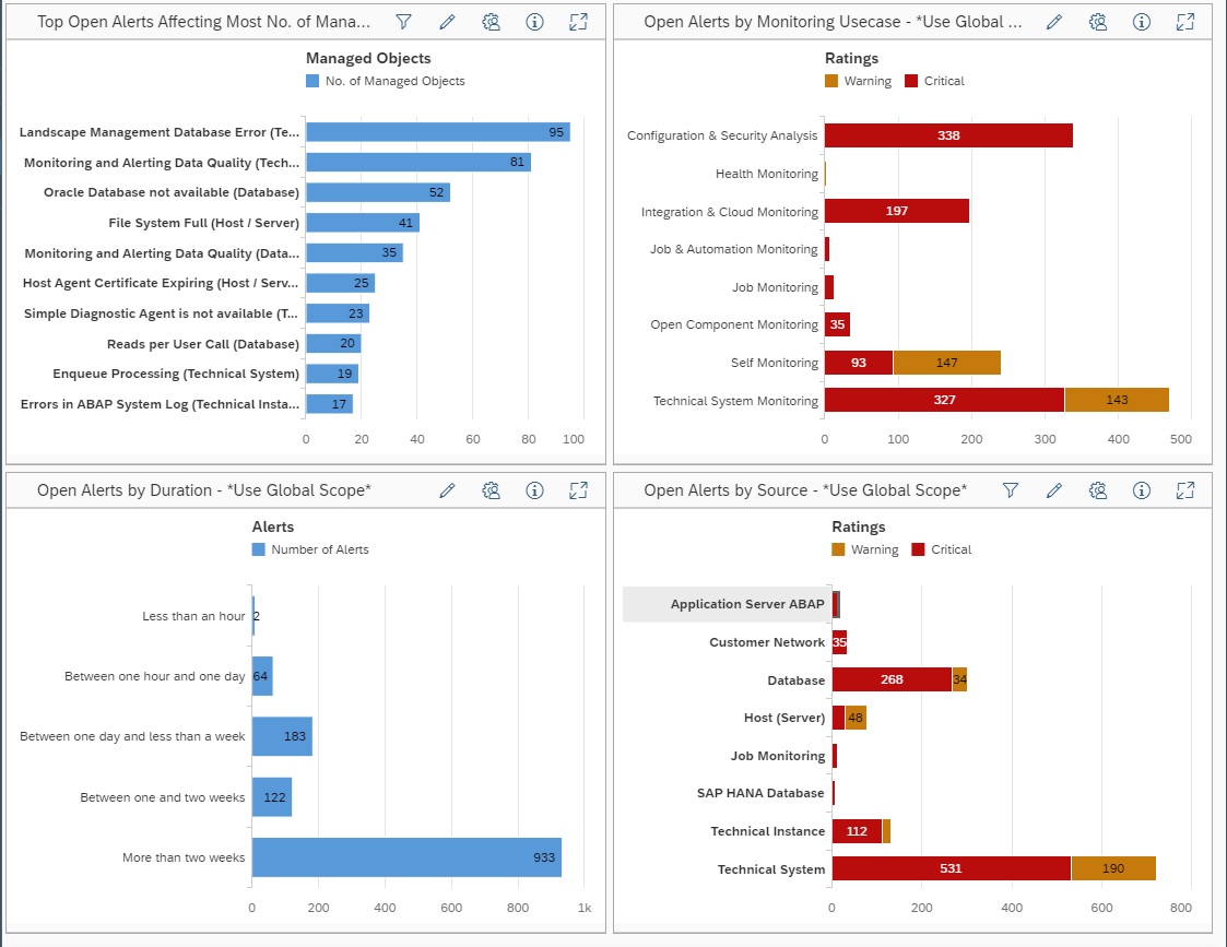
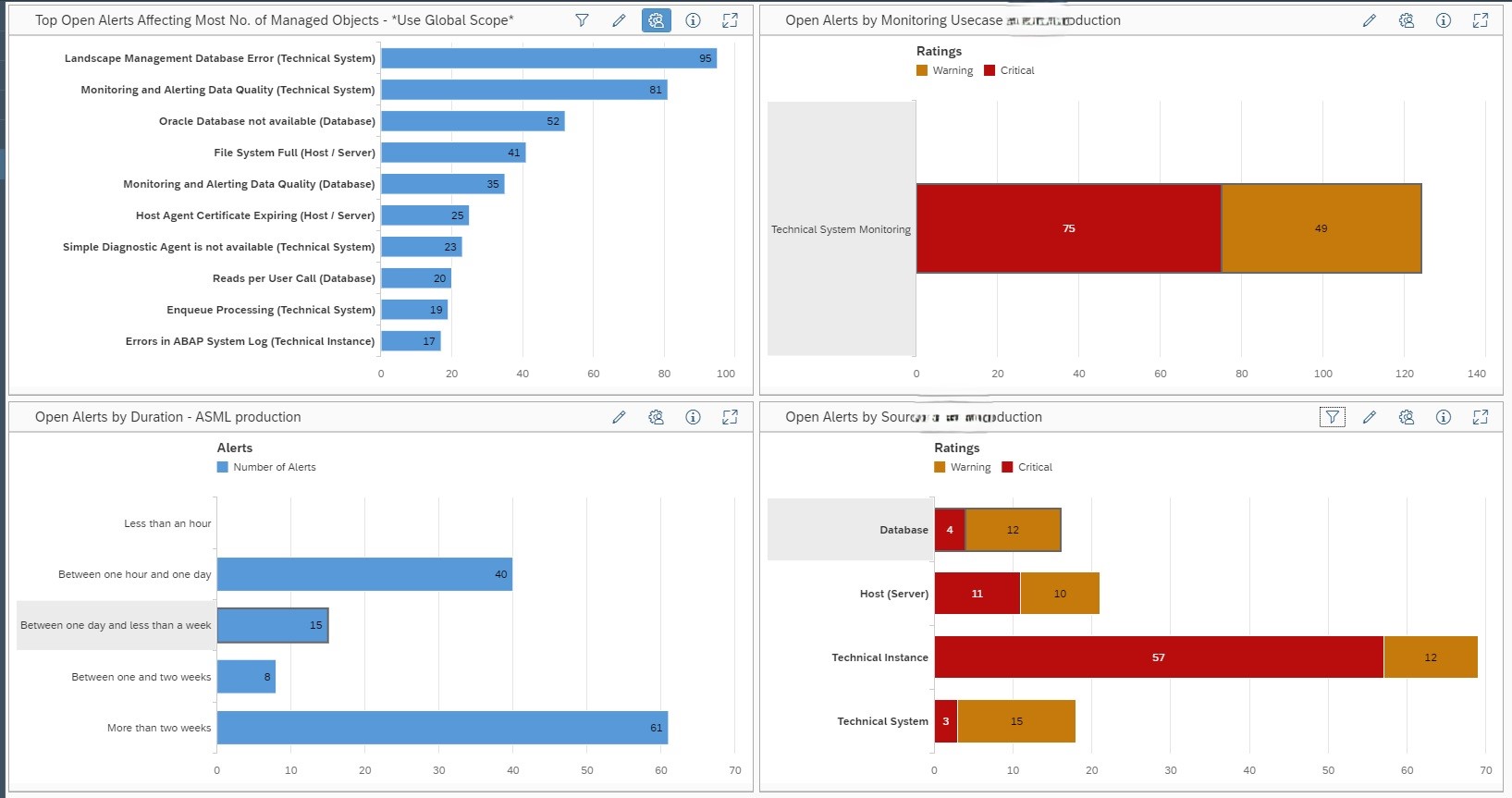
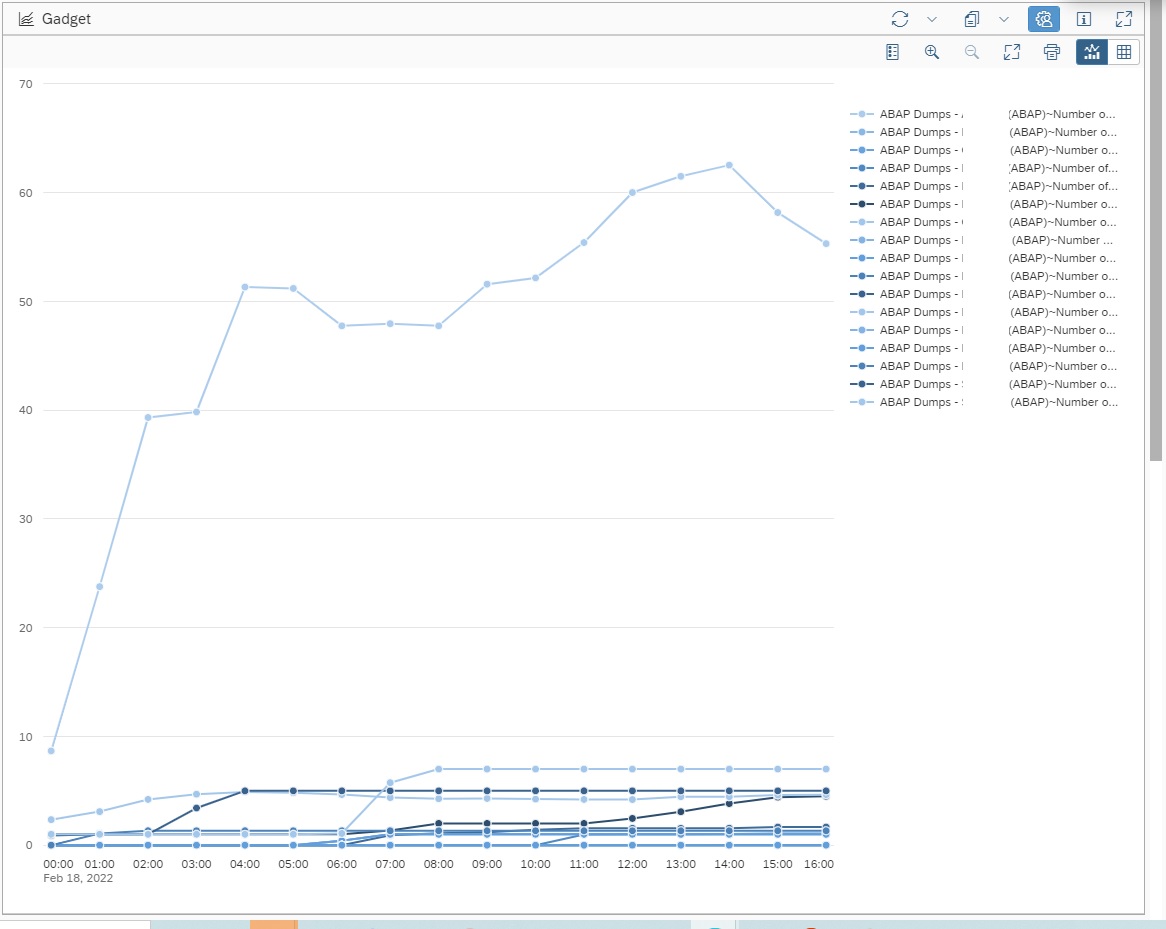
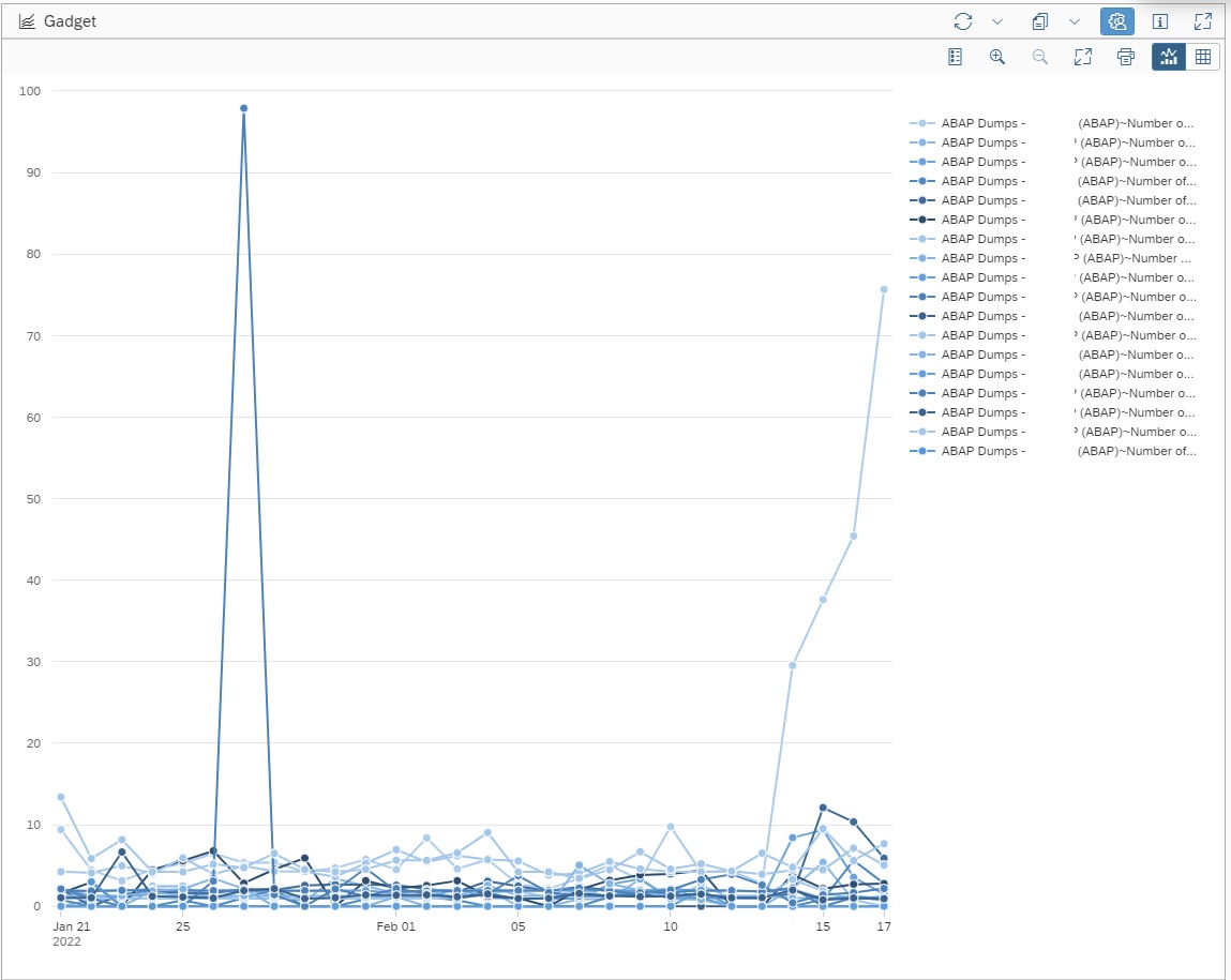
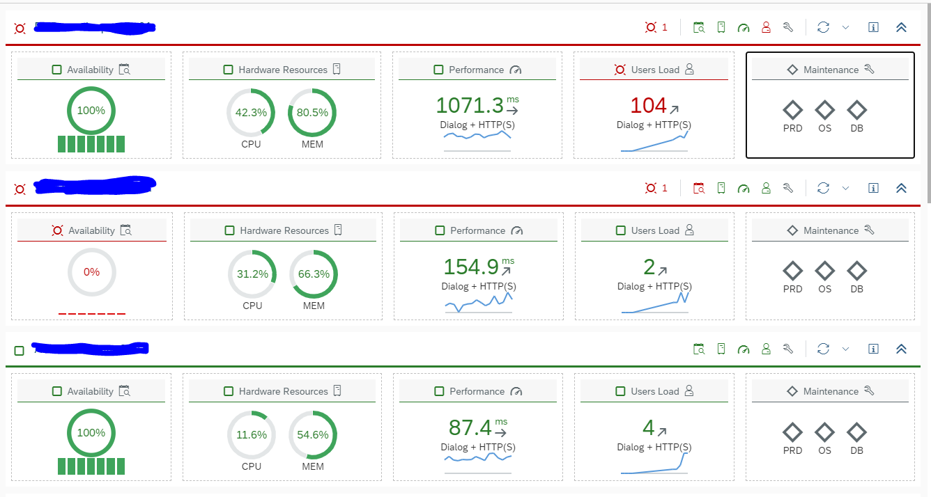
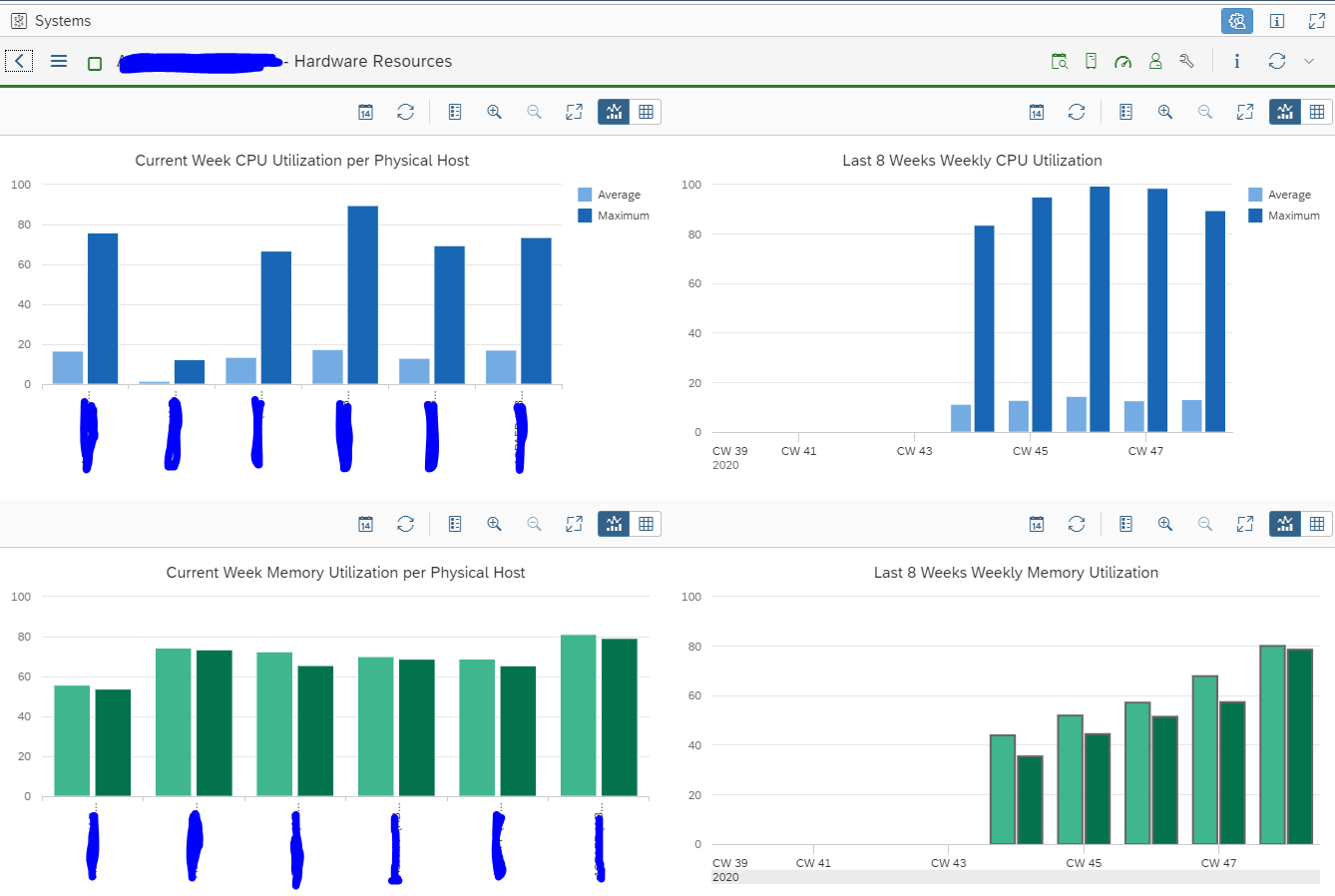
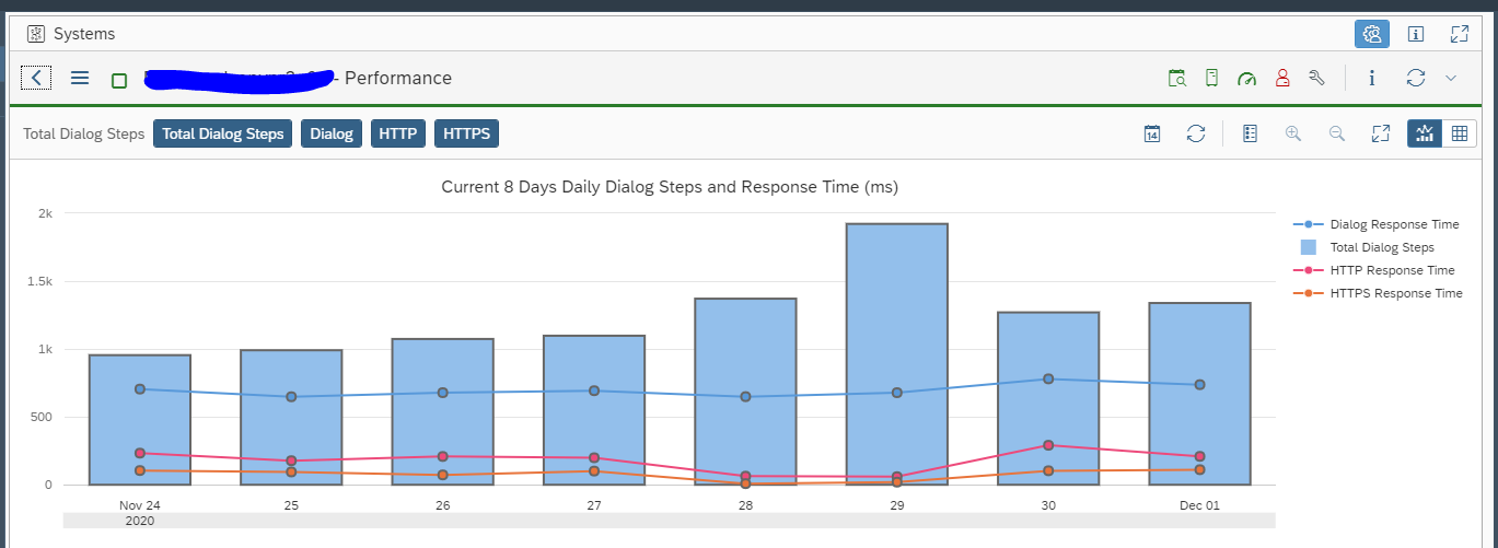
Example: Performance Monitoring Dashboard
Dashboard Components:
- CPU Utilization (Trend Chart)
- Memory Usage
- ABAP Dumps per Hour
- Dialog Response Time
- System Availability
How OCC Dashboard Helps in Performance Monitoring
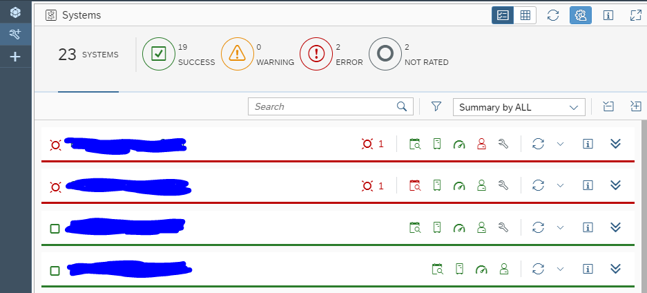
1. Real-Time Monitoring
- Quickly identify performance degradation
- View metrics across systems in one place
2.Trend Analysis
- Analyze historical performance trends
- Detect recurring issues
3. Root Cause Analysis
- Drill-down capability helps identify bottlenecks
4. Proactive Alerting & Insights
- Predict issues before system failure
- Improve system reliability
5. Custom KPI Tracking
- Track business-relevant KPIs alongside technical metrics
Business Value of OCC Dashboard
- Reduce downtime and performance issues
- Improve SLA compliance
- Faster issue resolution
- Centralized monitoring for large SAP landscapes
- Supports high-volume system monitoring environments [support.sap.com]
Key Differences
FRUN 4.0
- Focus on enhancing OCC dashboard functionality
- Introduction of new data providers (Events, KPI tracking)
- Improved visualization and analytics configuration
FRUN 5.0
- Supports large-scale hybrid monitoring scenarios
- OCC dashboard becomes part of:
- Unified monitoring
- Automation
- Alert management ecosystem
- Supports large-scale hybrid monitoring scenarios
Conclusion
The evolution from SAP Focused Run 4.0 to 5.0 in OCC dashboards represents a shift from advanced visualization to intelligent operations
- FRUN 4.0 enhanced the OCC dashboard with stronger analytics, new data providers, and KPI-driven monitoring, making it a powerful visualization tool.
- FRUN 5.0, however, elevates this capability by embedding the OCC dashboard into a broader, unified monitoring ecosystem—enabling end-to-end visibility across hybrid landscapes, integrated alert management, and scalable operations.